Sunday, February 25, 2018

The Geometry of Colour at Lehmann Maupin Gallery

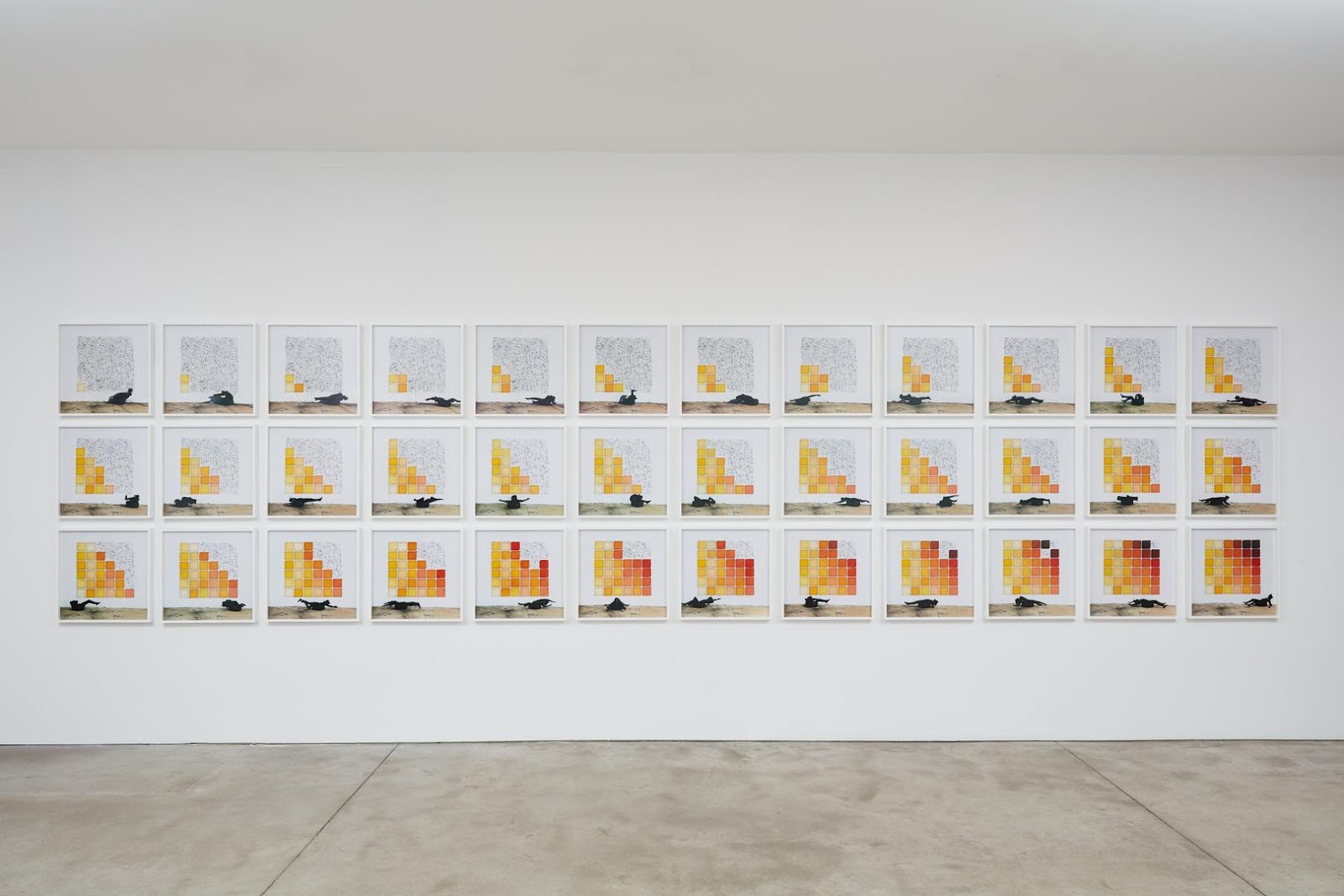
The Geometry of Colour is a body of works created by artist Robin Rhode. These works are cooperative visual and performance art, documented through c-print photographs, taken at a wall in Johannesburg.

In one work, Under the Sun, Rhode produced images of the pixelated sun’s rays for both the political and atmospheric climates that the regions share across 36 photographs. His sun rays join the long representational history of the sun, both as a benevolent father figure and as a symbol of victory and might, throughout monotheistic religions. The rays also revisit the theme of light as a sociopolitical issue—the expansion of the electrical grid to serve black townships was an early achievement of the African National Congress under Nelson Mandela.

I appreciate the form of Under the Sun and Rhode’s ideas on the metaphor of the sun rays. However, many of his thoughts come to me from the statement, not the work itself. In the exhibition, some of his works show the beauty of geometries and documents of his excellent performance. However, it is hard for audiences to associate geometries with sociopolitical issues. Because geometries in artworks are more like unemotional expressions, it is too abstract to related spectrum to the metaphor of sun rays in history. To think personally, the document of his performance is a second pass which will lose a strong and dynamic expression. The original work should be more impactful on the concept.
David Hockney at The Met

I can feel a clear and strong direction in David Hockney’s retrospective at The Met. In his early works, he focused more on abstraction but his later works are more representational, he has a strong interest in how to use color, form and figuration to express everyday experience. Even though some of his paintings do not include human figures, such as his still lives, paintings of buildings and swimming pools, all of these reflect aspects of contemporary life.

One of the many reasons that his work is successful is its connection between his painting and modern design — the paintings’ vibrant, pure color and graphic shapes, the contrast between textures. All these elements are carefully composed and manipulated by Hockney. Because his work resonates in the context of consumer society, even a person who does not know much about art could likely be attracted to it. 


As a photographer, I appreciate the way his work explored perspective. His photo works provide multiple ways to view the world simultaneously. The juxtaposition of many photos amplifies the differences between the camera and the human's eye, thus showing that technology cannot fully represent space.

Friday, February 23, 2018

Review: Brian Alfred " Future Shock" at Miles McEnery Gallery

The first piece of the exhibition is called “Enclaves of the Future.” I feel a lot uninteresting at my first impression of this work alone, but it does make sense if we associate this one with the exhibition title and rest of the works. This painting as the opening, it aggressively put the viewers in the dark side. In this way, when we stand in front of it, the layered weird neon colors in the background give the viewer a lot of pressure and fear, because you do not know what is coming towards you.
Among Brian's works, he mostly uses architectural, mechanical, interior and urban landscapes, and what is important is that many of it depict "no man's land." There is no living existence, only from his sufficient positioning the sense of light, showing that the traces of life. For instance, the "Personal Stability Zones" and the "Time Horizons," those two paintings depict no man but implicate one concern of Brian is the extreme population density in the future.  
In his works, Blair emphasizes the composition of horizontal and vertical lines. In his painting "Sunlight and personality" and The "Time and Change," he uses straight lines and cold color tone to represent the radical attitude as well as the sense of powerlessness. 


revised review: Brian Alfred " Future Shock" at Miles McEnery Gallery
Mengni Feng

The first work in the exhibition is called “Enclaves of the Future.” I feel a lot uninteresting of this work alone because it seems just like a very typical night scene painting at my first glimpse, but it does make sense if we associate this one with the exhibition title and rest of the works. The foreground of the painting is the silhouette of the mountains and trees. Against the fantastic yet bizarre glow in the background, the viewer was passively in the shadow of the mountain and given a mysterious sense of unknown.
Alfred’s works mostly use architectural, mechanical, interior and urban landscapes, and what is important is that many depict no living presence. For instance, "Personal Stability Zones" depict the subject matter of population density as nobody appears. It depicts the aisle of the residential building with full of the hanging laundry that is almost blocking the entire building.
In his works, Alfred was trying to express the sense of powerfulness of human being by the composition of horizontal and vertical lines and cold color tone. In his painting "Time and Change," he uses straight lines and basic geometries portraits a scene of after flooded village. The entire scene seems too peaceful to ever think about sorrow. You can only accept the fact that human’s inability in the face of natural disasters.


Nature Confined at Tanya Bonakdar Gallery

Carla Klein explores greenhouse interiors across Europe through sweeping, panoramic compositions in her seventh solo show at Tanya Bonakdar gallery. Klein’s work is a mediation on opposites: nature and artifice, objectivity and subjectivity. Her subject matter is nature dominating a space where it’s meant to be confined. Low vantage points combined with life-sized botany give each painting a sense of power. Klein’s deliberate exclusion of humans contribute to her work feeling both old and new at the same time; her cool-toned landscapes surrounded by glass feel utopian and futuristic, while her warm, sepia depictions of banana trees are reminiscent of a prehistoric past.
The collision of nature and artifice is epitomized in one painting split horizontally- the top half is rendered naturalistically but the bottom is a vibrant red, resembling a print being looked at under the harsh red light of a darkroom. Klein’s jarring use of red draws attention to the synthetic process of photography, perhaps serving as a reminder that her paintings are created from the use of photographs, not just memory.

Klein’s technique isn’t particularly groundbreaking, yet the architectural elements of her converging lines and her dramatic use of one-point perspective feels modern, attracting the viewer into her picture plane. Although Klein’s paintings seem to transcend time, they undoubtedly question the role of nature in today’s  increasingly artificial and technology-dependent world.

Thursday, February 22, 2018

Particulates at Dia: Chelsea


To enter Rita McBride’s Particulates at Dia: Chelsea one must go through a single industrial door posted with a caution for exposure to lasers and radiation. Once inside it takes a minute for your eyes to adjust to the darkness, green lasers beam from across the space and a dingy brick shelter the size of a basketball court comes into focus around you. Sixteen beams span the length of Dia: Chelsea, forming a hyperbola around a single axis. A slight buzzing rings in your ears and you notice a consistent mist dispersing over the beams, intensifying the green wherever the light intersects with moisture. An uneven fence, Guidance “Barriers”, restrains visitors from getting unlawfully close to the high-intensity lasers. The more time one spends in the space, the more Particulates becomes about the environment created around and because of the lasers than the lasers themselves. There is an uneasiness about being in this dark space with the perpetual buzzing and humidity from the mist. Yet there is a desire to move around the space, ignore the fence to go under the beams and experience the work like other installations or sculptures.

Tanya Bonakdar Gallery: Carla Kevin

Carla Kevin's exhibition at Tanya Bonakdar Gallery in a huge and bright gallery helped to make large paintings look larger. Her works create a silent and calm mood. There are not any moving objects in her works, so when appreciating artworks, it is able to feel that environments around us have stopped or flows very slowly. However, at the same time, falling water image creates little noise at silence drawings. Her paintings make people think that they are walking into greenhouses deeper and deeper and looking for another spaces or rooms.

Moreover, the wide gaps between paintings lead people to appreciate the show slowly like her painting. These paintings are filled with leaves and pipes which we can see in greenhouses. The works do not look realistic, but they seem like old, vintage photographs because of the colors and lines. The colors she used to set the warm and comfortable tone.

Many of the works have white and bright backgrounds. However, some paintings are darker with brown backgrounds. The artworks that have dark colors make for gloomy, stuffy and even scary moods. One work that I was significantly moved by is half white and half red. The upper part contains comfortable and calm tones, while the bottom part is painted red. This contrast creates two different worlds. The red part looks like everything is destroyed, feels cold and hopeless. It is not as detailed as the upper part. Her paintings include both warm and cold, hope and despair, and the arrangement of paintings was enough and perfect to show the contrasts of tone and mood. 

Friday, February 16, 2018

Brian Alfred: “Future Shock” at Miles McEnery Gallery

It seems everyday one encounters news of a fresh threat to humankind, a new possible reason for the destruction of our species. Brian Alfred tries to capture this feeling of the world spiraling towards disaster. He succeeds in a handful of paintings, but only truly achieves his goal in the video piece on display. The video included the digitally produced version of most of the work in the exhibition, but it was the inclusion of dark synth music, camera movement, and a few strong pieces that were nowhere to be found in the gallery, that made it much more powerful. 


Communication of the idea that humankind is nonchalantly barreling toward ruin is an important part of this show, yet there were a number of pieces that detracted from that concept. The first piece you see upon entering the space, the painting cryptically titled, Enclaves of the Future, has an important job of setting the tone of the show. However, the painting fails at this task by simply depicting a night sky with no inkling of a planet wracked with environmental disaster and political strife. Nevertheless, Alfred produces some provocative and visually pleasing work that serves as an innocent envelope containing a message that accents humanity’s casual flirtation with destruction and chaos. 
(This is a promo video provided by the gallery that is similar to the video in the exhibition)

Thursday, February 8, 2018

The Whitney Museum of Art: An Incomplete History of Protest: 1940-2017


 Amid the sea of signs during last month’s Women’s March, one poster epitomized the event: “Too many demands to fit on one poster”. This more or less summarizes the ambitious selection of activist art in Whitney Museum’s 6th floor exhibition. The show reflected on finite forms of protest over the past eight decades, organized into eight themes ranging from protests against the Vietnam War to self-reflective appeals within the museum walls. Rooms filled with poignant war posters are juxtaposed with works such as Ad Reinhardt’s non-objective, relation-less black field painting to show that protest can happen in many forms.        

     The exhibition's inclusiveness is the outcome of a protest titled “Strike, Boycott, Advocate: The Whitney Archives”. Featuring objection letters from renowned artists against the Whitney, they disputed the museum’s bigotry and demand a more inclusive and accessible representation of artistic styles. It is a relief to read these letters and then witness how the Whitney was willing to admit its imperfections and has made efforts toward change. In recognizing their past faults, it is admirable to see protested institutions and authorities take the humility to acknowledge their protestors. Artists as protestors continues explore their ongoing relations with politic. 

The Whitney Museum of Art: Laura Owens Survey Review

Mirthful critters, absurd clocks, and portal-sized geometric paintings were among the main players in the survey of this mid-career painter. What I admire most about Owen’s work is her daring; Her kittens, monkeys, and pirate ships challenge a conventional understanding of serious contemporary painting. As does her choice to overlay chunky paint on vinyl-printed canvas or add sculptural details like pebbles, latticing, and bicycle wheels to her abstract paintings. These 3-D aspects of her paintings teeter somewhere in between boldness and gimmick, at times feeling overworked or to have too many moving parts. But in contrast to her defiantly playful new work, surprising depth is found in this exhibition in a central room of figurative paintings that explore the history of painting. Here 30 or so pieces, hung in close parlor-style proximity to one another, depict the Bayeux Tapestries, Toulouse Lautrec, flattened shapes reminiscent of Matisse, or painterly Bonnard-like floral marks. Contemporary subjects are also present such as embracing soccer players or loosely painted horses. A bright palette and cartoon animals might, in the hands of a lesser artist, arrive at something sardonic à la Jeff Koons. But what redeems this body of work from its overworked moments is Owen’s rigor in carving out new spaces for paintings to inhabit; Who’s to say a painting can’t be deliberately frivolous, humorous, or mischievous?

William Wegman at the Met


In “Before/On/After: William Wegman and California Conceptualism,” on view at the Metropolitan Museum of Art, William Wegman’s work reminds us that a significant faction of conceptual art has its roots in humorous pursuits. Wegman’s work is funny: it acts quickly and feels distinctly Californian and is in line with someone like John Baldessari, who was included in the show. During the video - Wegman’s donation of 174 of his short videos prompted the show - there was audible laughter from viewers. The humor is dry but rewarding and Wegman seems earnest in his pursuit of eliciting joy. In one video, Wegman, in a near deadpan, creates a narrative between a man and woman where the copyright information of a Merriam-Webster Dictionary acts as points of reference for these characters’ lives, resulting in an ridiculous application of copyright law. The exhibition also featured several playful drawings made by Wegman. “Distorted Vase,” is a twist on “Rubin’s vase,” an illusion where two silhouetted profiles facing one another make a vase in their negative space. The drawing has both profiles but they have been shifted up and down, distorting the illusion. The effect is goofy and succinct: the components of the illusion are present but the shift destroys the negative and the illusion is broken.

Monday, February 5, 2018

Hockney At The Met: Thoughts Afterwords - revised


 Hockney at the Met, was a tremendous review of the artist's career.  Exhibiting a handful of pieces that to some are considered the strongest work he’s ever produced. The show begins with his earliest work and travels to his latest years. The two middle rooms of the Met exhibition were my particular favorite. Containing paintings I imagine that are still warm from the sun, composed in their flat, pastel totalities. Images of leisure and a specific kind of California wealth and social-strata specific to where Hockney was in his career at the time. It is easy to embrace the formal calmness in this work. I find myself reading to much into what I perceive to be a somber group of pools, still figures, and vacant splashes. I loved Portrait Of An Artist (Pool with Two Figures) painted in the early 70’s, and American Collectors (Fred and Marcia Weisman) painted in the late 60’s. De Chirico meets a contemporary blasé’ness, a word I made up to fit a feeling. A warm sun- soaked stagnation of the most fortunate kind. I guess what I’m sensing is the rise, and maybe always present social disposition or hidden irony emanated from the perfection of these finely executed and choreographed spaces. The power of collectors and of the art market and mutual dependencies, and also of personal relationships and hopes changing into different realities. In the rooms leading towards the exit, huge canvases are filled with brightly illuminated explorations of interior and exterior spaces. Drawing from the bright colors of a painter like Matisse, these canvases will be sure to lift your spirits, away from thoughts of art markets, and power relationships. Upon exiting you can even snag a Hockney original lithograph for 12,000$ on your way out.