Thursday, April 26, 2012

Peter Shelton: powerhousefrenchtablenecklaces at Sperone Westwater


Peter Shelton sculptures were produced from 1989 to present. Each sculpture is abstract but also combines more literal imagery. Elemental combinations of water and bronze are vibrant in each piece. The kinetic sculptures fill the room with sounds of gentle splashing water. The calm and somber sculptures have a connection to the human body by use of hollow vessels and slow running water.
Peter Shelton titled his show powerhousefrenchtablenecklaces. This obscure title links some of the materials used in the show bronze, copper, French table, necklaces, random items, and water. The cover of the shows card has an upside down skull with water dripping out of the nose hole. This sets the tone for the ritual experience the viewer is about to embark on. One begins to roam slowly throughout the installation. Each large sculpture, warm in color and sound, invite the viewer to come closer and investigate each piece. In powerhousefrenchtablenecklaces one of the sculptures has water running all over necklaces. After exploring each piece you begin to focus in on how many moments each sculpture has. The house pictured above hangs with a creepy slight tilt and copper tubes running in and out of each floor, nook, and cranny inside the house. As you peer in you can see each floor has water running down the stairs filling up the cavity of each empty space. The viewer feels like a giant peeking in on a shrunken flooded home. The connection between water and the empty cavities is close to human bodily fluids and the hollow yet complex vessel the human body. Each sculpture has so many different angels in which to view each assemblage. 

Shelton uses many different sculptures that represent vessels throughout the entire installation.  (Pagodawindowskull, 1993. Bronze, water, copper, pump, and wood, 68 x 16 x 16 in. 600 (172.7 x 40.6 x 40.6 cm.) This piece has water dripping from upside down architecture onto the skull. With the water dripping all over the bronze and copper it begins to have the texture of skin. The soft glistening copper is reminiscent of the dermis. Using a skull is tricky in fine art and it can be a cliché, but how Peter Shelton combines the water and material is removed from cheesy skull art.  Shelton sculptures do not have a gothic or grotesque tone. The materials balance each other out with the hard outer surface laced with running water. The bronze shine sharp hints of blues and iron oxide tones while the water curls over the top half of the skull. The assemblage with kinetic movement and sound gently touches the senses. Shelton's installation powerhousefrenchtablenecklaces is full of sculptures that link the vessel and the human body. The connection between body and fluid is shown throughout the installation space. Once you enter the other room two large sculptures appear opposite in texture and color. 

These large-scale fiberglass sculptures are intense. They look like gigantic body organs with many different holes. The sculptures welcome viewers to approach and investigate the meaning. The connection between vessel and human body become clear in this space. You can peer in each hole, even the awkwardly placed holes where the viewer has to kneel down to see. These pieces take some participation to fully embrace the connection between vessel and body. These pieces in conjunction with the bronze pieces in the other room are a reference of body and fluids. The sculptures also appear to be soft sculptures but in reality are fiberglass. The contrast of hard and soft is like the human body. 

Peter Shelton: powerhousefrenchtablenecklaces is a strong installation that utilizes kinetic sculpture. The combination of vessel, fluid, architecture, and human body links use with the material items we surround ourselves with. Home and body in conjunction with vessel and water are important themes in Shelton’s installation. Water is an important element that is vital to our survival on earth.

MOMA's Print/Out (revised)


Print/Out: 20 Years in Print is the Museum of Modern Art's highly anticipated survey of a medium that is versatile, rooted in history, and appears to have no limits. Chief Curator of Prints and Illustrated Books Christophe Cherix displays works by more than forty artists in a salon style show with prints literally installed from floor to ceiling. If stunning the viewer with hundreds of prints ranging in size, content, and execution is what Cherix set out to do, then surely this mission was accomplished.

A curator is faced with the task of creating a common denominator amongst included works, a theme or idea that the viewer must interpret. In Print/Out the differences, ambidexterity, and individualism of the numerous printmaking methods are what bind the show. Many of the works are steeped in conceptual ideas such as Martin Kippenberger's Content on Tour which is an appropriation of an appropriation. He uses printmaking as a means to an end, sometimes cutting and slicing his own prints to make paintings.  Others refer to and question the history of the medium, inventing new techniques for age-old processes such as Jacob Samuels creation of the first portable aquatint box (1996).

Printmaking began as a mechanized way to produce multiples, an idea that lends itself to portability and affordability, but Cherix has made it clear that editions are no longer a requirement for this medium. In fact only two editions, in entirety, are included in this show, Kara Walker's Safety Curtain (1999) and Damien Hirst's The Last Supper (1999).  Walker's series highlights her preoccupation with paper cut-out style grotesque yet humorous imagery focusing on slavery. Hirst's is a pop-art series of large colored silkscreens of fake food labels. Both artists created a suite of images, editions comprised of many different prints. All of the intended images from the series are represented at MOMA, but are easy to miss for they are spread out amongst the hundreds of works on the entire sixth floor.

With such a mishmash of prints, and with the large amount of them on display, smaller intimate works are easy to miss, but are worth noting. For example Julie Mehretu's Untitled (2004) from the  Landscape Allegories series. This etching is an exploration of line and shape, referencing both nature and mathematics. It resembles a topographic map overlaid with imagery derived from nature. It is a traditional print, using multiple layers and transparent inks to achieve a broad range of color and tone, and is one of an edition of seven.  The print is technically stunning and seems fragile and airy.

The more classic methods of printmaking are juxtaposed with installations of groups such as Superflex, who held a particpatory workshop where the viewer can construct a hanging lamp with pre-printed photographs. General Idea's group project, Magic Bullet (1992), is also a memorable non-traditional take on reproducibilty and distribution. Hundreds of silver pill-shaped balloons imprinted with their logo fill the ceiling' skylight space, but only as long as the helium's lifespan. Viewers are invited to take home any of the piece's fallen soldiers, an interesting comment on the intended portability of the print.

While many of the historically rooted prints included in the show seem to be overpowered by bigger installations, and even the gallery walls themselves which were covered in Benday dots, Cherix's decision to display the many modes of printmaking in a salon style exhibit with prints covering nearly every inch of the exhibition shows that there is not one correct or preferred way to make a print these days. Equal opportunity is given to all of the modes of making. The show examines the many possibilities of a medium that is often pigeonholed as outdated and uninventive. By having a medium-specific themed show, the viewer leaves not thinking of an inner dialogue about what it all means but with a visual cornucopia of images and a greater idea of the unlimited possibilities that can be found under the umbrella of printmaking.


Wednesday, April 25, 2012

Diego Rivera: Murals for the Museum of Modern Art

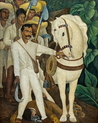
Agrarian Leader Zapata (1931)

The Museum of Modern Art revisits its own 1931 single-artist retrospective with Diego Rivera: Murals for the Museum of Modern Art. The original show opened with five frescos that Diego executed on site specifically for the museum. Of these five initial frescos, four, such as Agrarian Leader Zapata, were based on small sections of frescos in Mexico that cemented Rivera’s international reputation as a renowned muralist. The fifth fresco, The Uprising, aesthetically bears resemblance to the group, but is not based on any part of Rivera’s previous murals. After the 1931 show opened, Rivera continued to develop three additional frescos, all original and based on New York City’s architecture and economic issues of class division and industrialization.

All of these frescos were executed on portable walls in an attempt to solve the problem of showing frescos to an audience wider than those who could see them on the buildings or structures upon which they were painted. Americans, most of whom would not otherwise have seen Diego's frescos, could get a glimpse of what his work looked like. Unfortunately, a small section of a mural is not the same as the entire thing. Rivera failed to convey his fresco’s beauty and meaning in these fractional recreations. Then, as now, his immense talent and ability were not perceived by those who based their assessments on these works and nothing more.

Balcony of Cortez Palace in Cuernavaca, Mexico
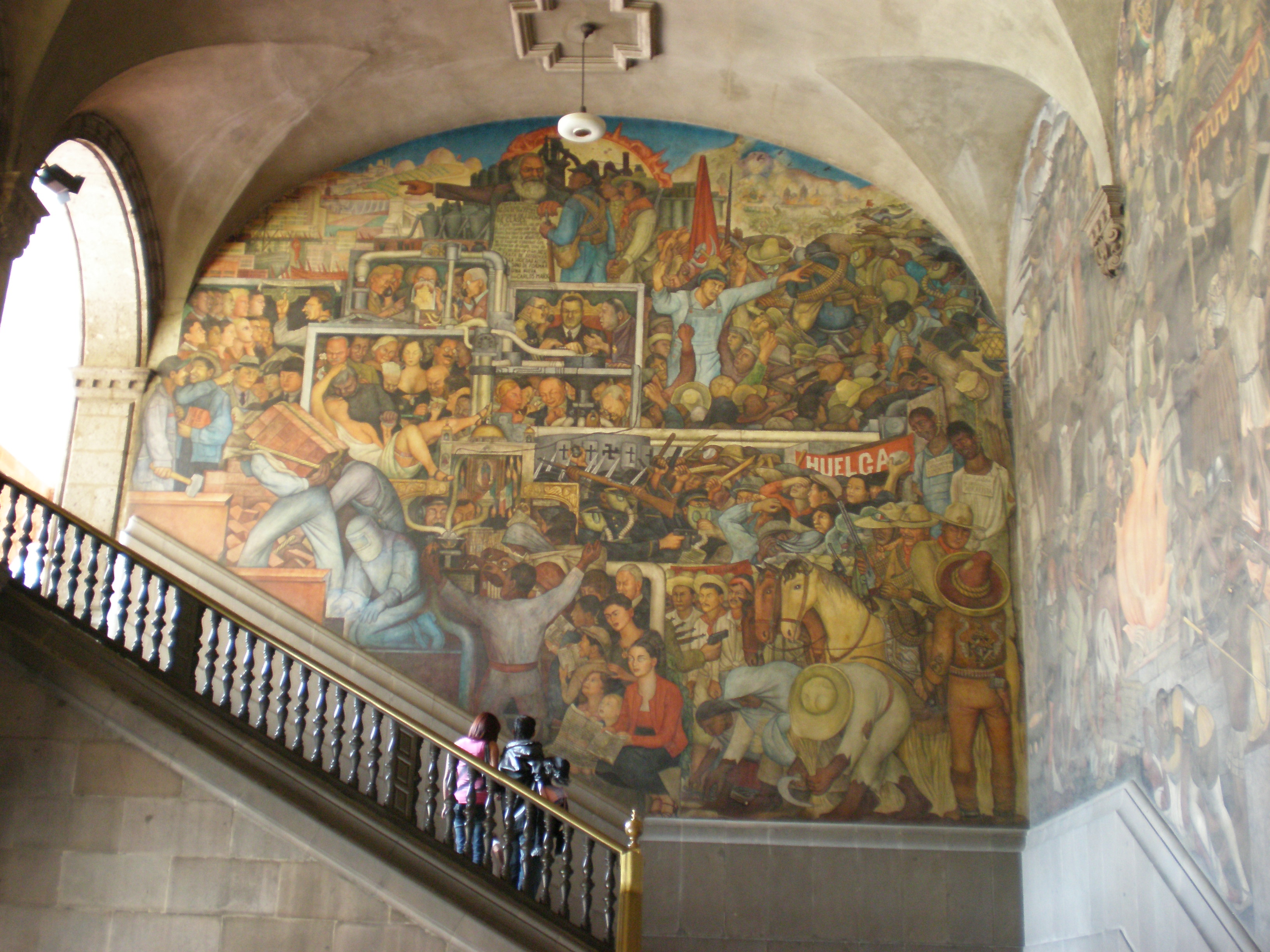
It is disappointing that curator Leah Dickerman chose to repeat the flaws of the 1931 show by excluding any meaningful information about the larger murals that Indian Warrior, Sugar Cane, Agrarian Leader Zappata and Liberation of the Peon were based on. It could have been especially valuable to include, among all the other information on the walls, small pictures showing the detailed murals that each of those came from. Within that context, the aesthetic value and technical innovation of the portable Rivera panels would finally have become apparent.  

The strength of this show is in its didactic approach to Rivera’s techniques. MOMA takes good advantage of the materials available to them from recent conservation work on the series, such as x-rays of the wall supporting the Agrarian Leader Zappata fresco. The inclusion of information on fresco techniques, such as giornata, and two of Rivera’s large cartoons help connect the technical details to the frescos on display. Dickerman even includes a list of the pigments Rivera used (though neglects to elaborate on binders, which given the other technical details included feels like an oversight).
Rivera's mural at The National Palace in Mexico City


Unfortunately, the rest of the show is full of even more missed opportunities and distractions. An example of the latter is the sketches from Rivera’s trip to Russia. Though Rivera met Alfred Barr while on this trip, there is no clear reason why the curator chose to include the sketches from Diego’s trip to Russia, other than to fill space on the wall. The sketches and information shown about the Rockefeller mural is an example of the former, an incredible opportunity not taken by the curator. The way this part of the exhibit is presented, Diego is portrayed as cluelessly spiteful of his American patron or petty in his oblique political statements. In reality Diego had a convoluted relationship with America- this played out dramatically around the Rockefeller mural project. He was rarely anti-America, but he was always anti-imperialism. Nor were his political interests a surprise to the Rockefellers or anyone at MOMA. He was simply such a famous, popular and important artist at the time that he was given commissions at MOMA and Rockefeller Center in spite of his well-known radical political positions.  

Rivera’s unique blend of traditional European iconography with less familiar Mesoamerican iconography and stylistic references is charged and designed to signify his work’s broader meaning. The biggest loss from MOMA’s decontextualization of Rivera and the fresco’s in this show is that it dilutes meaning to such an extent that viewers are bored instead of challenged.

Friday, April 20, 2012

"March Forth" by Henry Taylor at UNTITLED


Henry Taylor, a Los Angeles-based African American artist lauded for his colorful acrylic portraits, has a gift of capturing the nuanced moods of his sitters despite using a bare, non-naturalistic painting style. March Forth, his new solo exhibition, is a foray from these figurative paintings into drawing, sculpture, and installation. Inspired by Taylor’s recent trip to Ethiopia, the gallery has been transformed into a low-lit abyss complete with a dirt floor, a taxidermied hyena, and a reconstructed hut of found objects. Taylor’s search for self-expression with new media regrettably feels like a stereotypical African rendering.

The major portrait included in the show is Taylor’s looping home video, presumably created during his trip, projected on the wall above the gallery’s entryway.  His muffled speech into the camera draws our focus to the image of himself as sitter. The sun gleaming behind his left shoulder showers rays across his unclothed body, which fluctuates between discernible and silhouetted due to his enthusiastic movements. Flanking the seating area below the video are walls covered sparingly with partly erased outlined figures and ambiguous text, including a series of letters that metamorphose from the shape of a “U” to that of a “Y” accompanied by the parenthetical “This is not a Y,” to an upside down pitchfork, the eyes of an outlined figure, and finally the shape of a hook. The fact that these transformative images neighbor his introductory self-portrayal sets the stage for the show as Taylor’s efforts to push his art in a new direction.

One of the large-scale works in March Forth is a black hanging sculpture that spans the gallery’s rear wall.  The twelve-foot long untitled piece consists of plastic bottles, detergent containers, and gas canisters nailed to a plywood support spray-painted black. Taylor undoubtedly recognizes their resemblance to traditional African masks, and he accumulates the containers into a collage of varying shapes so that faces of numerous dimensions pop out. This concept is hardly new, conjuring the painted jerrican masks by contemporary African artist Romuald Hazoume. Yet the two artists differ in their treatment of the containers; Hazoume employs uniformity in his assemblage while Taylor abolishes it. The latter’s approach is spontaneous, subtly applying order to a haphazard collection of bottles that might have once been scattered across his studio floor.

Bidon Armé by Romuald Hazoumé, 2004
The centerpiece of the show is Taylor’s reconstructed Ethiopian hut taking up the central space of the gallery. Made up of found and collected objects, the hut is a hodgepodge of brooms and other cleaning tools, a rolled up rug, wooden wheels, ladders, beer bottles and walking sticks for the blind. The openness of the structure welcomes the viewer in for a turn around its interior, and inside are piles of dirt that appear placed equidistantly apart. At its back sits a television playing the video interview of an Ethiopian boy, a Denny’s box sitting atop as if signifying a westernized influence. The hut appears to be an attempt at calming or systematizing a chaotic assortment, but falls short of intelligibly communicating any greater purpose. The materials do not seem to be placed schematically aside from the goal of allowing the hut to securely stand. Taylor has been known to use found objects like cigarette packs and cereal boxes as surfaces for his paintings, but the theme in this context—dirty and lacking a framework for deeper contemplation—reads as a clichéd characterization of Africa.

In March Forth, Henry Taylor’s exploration into sculpture and installation is the focus of the show, but too many stereotypical elements—the dirt, the hyena, the hut—give the show a banality and drown out the profundity behind these new creations. For a figurative painter with such a knack for capturing the idiosyncrasies of his subjects and the larger cultural implications they represent, these qualities are not portrayed through this show.

Alejandra Prieto's Invisible Dust at Y Gallery


As evident in Richard Serra’s work with lead, Robert Smithson’s arrangement of salts and Dan Flavin’s infatuation with fluorescents, humble materials are quite capable of conveying strong ideas. At her first New York solo show, Alejandra Prieto is changing the perception of coal. In Invisible Dust at Y Gallery, the artist uses just four works to prove the versatility of her signature material and to make an even greater argument for its significance as a cultural artifact.
For a show dedicated to coal, it is only fitting that the gallery space is below street level. Like a miner at an unfamiliar site, one feels the urge to duck upon entry, relaxing only as the stairs and antechamber give way to a cavernous room not seen from above ground.  It is here that each of Prieto’s four works gets a wall of its own.  
The first work to catch the eye is Concave Coal Mirror set against the far wall. Spanning six feet in diameter, the work’s unsettling effect is not derived from its imposing presence, but rather its surface. Though coal has a reflective quality, the rough and rubbed textures create a mixture of matte and gloss finishes, making a full reflection impossible. As the surface fails to disappear in the eye of the viewer, he or she is fully aware that they are looking at, not into a mirror. What seems like a novel invention on Prieto’s part is instead a reintroduction of an ancient technique, as coal was used to produce mirrors in pre-Columbian societies. 
Set opposite the mirror, and continuing the Mesoamerican motif, is Ornamental Dust (Chita), a coal dust print on black silk. The fabric illustrates a repeating scene of jaguars and parrots in contrasting patterns. The illustration is styled after the animal imagery found in temples, as if the piece were nothing more than a wall rubbing. A second coal dust print on black silk, titled Ornamental Dust (Laberinto), rests on another wall. It features a more contemporary geometric pattern that would be equally at home on a high-end scarf, or alongside the Chita print in a Mayan-themed gift shop. 
Alejandra Prieto - Cloud on Coal Screen
Cloud on Coal Screen
Prieto switches mediums with the exhibition's most interesting piece – Cloud on Coal Screen, a video projection displayed on a slab of coal. The titular cloud is made of coal dust, and like time-lapsed satellite footage of an oil spill, the viewer watches the inky blob metastasize across the glassy blue surface. 
With this video, Prieto reminds the audience of the destructive force that goes into coal extraction. One does not have to think hard to recall the Copiapó mining accident of 2010 (an occurrence that came just one year after Prieto began showing her work with coal). Thirty-three Chilean miners were trapped underground for over two months. Plumes of dust and smoke similar to the projection’s were certain to have erupted there. As a Chilean who locally sources her materials, Prieto likely has working knowledge of the human toll inherent in mining this commodity.
In Invisible Dust, Prieto makes a compelling case for the reconsideration of coal as an art material and the reevaluation of socioeconomic relationships between the haves and have nots. Standing in the intersection of all four works, one is aware of Prieto’s deft handling of coal across multiple media as well as her optimization of the limited space, staying well clear of the material’s saturation point. From the same vantage point, the tension between labor and indulgence is unmistakable. A civilization’s lifestyle faces off with a superficial representation of itself, while a raw material parries with a commercial good. Coal’s sooty texture supersedes the luster of the luxury items, blackening the silks, masking the mirror and flooding the projection, subtly shaming the viewer into questioning whether his or her purchases are worth more than the wellbeing of the working class.

Friday, April 13, 2012


FINAL:  JODI, "Street Digital" at MOMI

JODI: Street Digital, an exhibition at the Museum of the Moving Image, brings together work by a two-artist team that rose to prominence in the mid-1990s.  Known as pioneers of “net.art,” JODI is the collaborative project of artist duo Joan Heemskerk and Dirk Paesmans.  Street Digital showcases the duo’s groundbreaking vision with works ranging from 1999 to the present.  Using the virtual language of HTML, JODI’s tinkering with digital code is an antecedent to today’s ubiquitous computer viruses and Mal ware designed to infiltrate and sabotage otherwise perfectly functioning software.  By manipulating small bits of code, JODI riffs on a commonly held perception built into the very framework of our technologically driven world – that is, mainly it’s ability to control vital industrial processes while maintaining a reliable modicum of order for our civilized society.  In doing so, the artists frame an alternate experience of the flashy World Wide Web that inundates the senses with malfunctioning games and digital signage gone haywire.  Using hack-a-day tactics to splice and reconfigure bits of conventional digital software, JODI seems to question the underlying stability of these existing structures by disrupting our common perceptions about their function. The resulting exhibition creates an experience in which the modern world as we know it seems as if on the verge of a catastrophic collapse and effectively pokes a large in hole in our assumptions about technology’s role in maintaining social order and stability.  In doing so, JODO stages a kind of self taught, DIY aesthetic seemingly available online to anyone with a penchant for anarchy and decoding “how-to” manuals as a way of creating disorder.
The first piece the viewer encounters, LED Puzzled (2012), dominates the entrance to the exhibit in its scale as well as the visual noise it creates through its pulsating strobe effect.  The blinking system of lights lies on the floor against the backdrop of a blue-lit wall of roughly the same proportions.  Much like the omnipresent assault of information that characterizes modern urban experience, the cacophonous broken mosaic resembles a broken digital sign that has taken on a life of its own. The scrambled LED components create brightly flashing geometric patterns, as if a mutant virus had suddenly commandeered the giant screen, destroying its intended purpose.
Perhaps one of the more interesting interactive works, “SK8Monkey on Twitter,” a performance on view at the opening reception, plays with the viewer’s common perception of today’s social media forum as a normative space of shared communication.  In this particular piece, a wireless computer keyboard replaces the traditional deck of a skateboard, which is ridden by a skater in real time and space.  The rider’s foot patterns string together incoherent groups of letters and numbers in a live Twitter account that appear to mimic a bizarre type of hacked computer code.  When the rider’s foot strikes the return key, a tweet is sent in real time and posted on the Internet. 
Another interactive piece, Untitled Game ("Arena," "A-X," "Ctrl-Space," "Spawn") (1996/2001), is the earliest piece in the show.  It is defined by four large-scale screens, tethered to game controls, which envelop the viewer in a 360-degree space of absorption.  The game controller dictates the on-screen action by pressing buttons that create exploding noise, mimicking the video game Quake.  In JODI’s modified version, however, the controller produces effects that are reflected in unusual patterns of black and white lines, and shapes on the four screens but the nature of those effects are unclear because the normal visual environment that accompanies the game have been deleted. Thus what the viewer is actually controlling is questioned, offering a strangely hacked version of the game.
JODI’s interest in tweaking aspects of the ever-changing digital medium as a means of reconstructing our experience of it now seems commonplace in a world where computer hacking and viruses are the norm.  “Street Digital” forces the viewer to reassess their relationship to technology by laying bare the fallibility of the processes that ostensibly drive the modern world.  JODI exploits our fears about technology’s apparent unreliability to do what it was designed to do and what that could portend in the wrong hands.  In turning otherwise innocuous games, signs and social media into symbols characterized by a breakdown in coherence, Street Digital foreshadows the possibility of a future world in which the underlying structure and function that we largely take for granted, might unravel into chaos at any given moment.

Cindy Sherman at the Museum of Modern Art [FINAL]

To be fair, any retrospective has highs and lows, and the Cindy Sherman exhibit at MoMA is no exception. On the one hand, the expanse and diversity of work from her early career in the mid-1970s to the present is impressive, considering Sherman works almost exclusively in self-portrait photography. For those looking for thought-provoking work, her beautiful and famous “Untitled Film Stills” (1977-1980) steals the show. Each print is enticingly ambiguous, and Sherman shows off her wondrous ability to transform into an array of different characters with minimal makeup and props. In nearly every print, Sherman is the only figure, but the frozen action suggests additional—probably male—characters just out of the frame: in “Untitled Film Still #10,” Sherman, picking her spilled groceries off the kitchen floor, glares up at him with a mixture of anger and fear. The quiet profundity of this work invites questions and interpretations both on the ambiguous character and scene as well as Sherman’s larger sociopolitical message on the objectification and fetishization of women in art and media.


Unfortunately, as one moves through the exhibition, “Untitled Film Stills” is nearly drowned out by her food-and-body-fluids period of the late ‘80s. These are some of the most difficult pieces to forget, not because they are conceptually strong, but because they are simply disturbing and unpleasant to look at. One can perceive Sherman’s transition into this phase with “Untitled #175” (1987), perhaps the last of the earlier works allowing the viewer time to pause. Sherman’s figure is hard to detect in this composition. We first observe, scattered across a beach towel on the sand, a pile of half-eaten donuts and pastries, before noticing the puddle of vomit next to it. Then we finally see Sherman, her hysterically weeping face reflected in a pair of sunglasses in the background. This work is clearly meant to bring to mind issues of body image, self-hatred, and consumerism, and for some viewers this may be disturbingly familiar. But Sherman is delivering her content without leaving much room for interpretation or imagination. And this portrait, conceptually shallow compared with the previous work, is the first in a series of increasingly distasteful prints which so heavily feature chewed-up food, pustules, vomit, feces and prosthetic genitalia that it’s difficult to look at them long enough to extricate any meaning at all.


The benefit of these loud, less successful works may be that Sherman’s quieter work is intensified, and welcome in comparison. The exhibition includes one unexpected gem: Sherman’s 1975 stop-motion animation, “Doll Clothes.” It is one of the few, if only, titled pieces, and the only time-based work. In it, a paper cutout of a nude Sherman, embarrassed at her nakedness, dons a paper doll dress and admires herself in the bureau mirror before being captured by a pair of large hands, which strip her and put her back in her case. Though the animation is inexpert, the film manages to encapsulate the theme of Sherman’s entire body of work not only by illustrating her personal preoccupation with dressing up and adopting alternate personas, but as a tale of frustration accessible to nearly all women. We are pressured to invest time and money taking care of our appearance, but society remains obsessed with our nakedness and helplessness, and ultimately we are not in control of our own bodies. The film concludes with a humorous but somewhat profound presentation of the many cutout figures used in the animation, arranged in a caterpillar-like queue: here, bunched together, are the innumerable faces of Cindy Sherman. If only the entire exhibition could be replaced with this single work.

JODI:Street Digital at the Museum of the Moving Image

Digital information constantly bombards us. With our smartphones always on our bodies, we can navigate the physical world tethered to technology; we can't help but live in a world where cyberspace is omnipresent. Our use of technology is so interwoven with our every day lives that we take for granted our dependance on it. JODI: Street Digital is a multi-sensory experience that makes transparent our relationship to the technological world by temporarily breaking it. Since the mid-nineties and the beginning of the dot com age, the art collective comprised of Joan Heemskerk of the Netherlands and Dirk Paesmans of Belgium, has been creating innovative video and internet art. Using video, software, and the World Wide Web, JODI creates work that exacerbates the break down of technology, or at least our relationship with it. By hacking into our computers, creating viruses and altering programming codes, they repurpose technology disfunctionally. 


JODI: Street Digital showcases some of the duo's most visually and conceptually stunning work since 1999. Walking up the modern white staircase up to the MOMI's third floor, the viewer concedes to an onslaught of strobe-like blue lights and reverberating bass-heavy noises. The first piece on view is overwhelming. LED Puzzled (2012) lies on the floor and consists of a segmented grid of broken up LED screens, reminiscent of the imposing screens that feed us advertisements in Times Square. Each screen flickers disjointed text and unrecognizable imagery; a labyrinth of cords and cables surround to create a chaotic nest on the floor. With the lights dim and a thunderous noise emanating from behind the adjacent wall, this first piece sets the tone for the ominous and dark yet witty evocation of the show at large.


A black painted wall separates LED Puzzled from Untitled Game ("Arena," "A-X," "Ctrl-Space," "Spawn") (1996/2001) on the other side. Perhaps the most exciting piece in the exhibition, this interactive "video game" JODI created by modifying the code for the violent first-person shooter game, Quake. Surrounded by four screens on four sides, the viewer is invited to pick up game controllers from the floor. After some experimentation, one realizes that the seemingly random exploding black and white images on the surrounding screens are actually manipulated by the viewer. On one screen, bursts of white small squares flicker, as everything but the fire exploding from the player's weapon is erased. Stripped of all color, form, and recognizable imagery, the computer game is basically functioning on glitches alone. Audio intact, the viewer experiences playing a video game with no objective, no rules to follow, no game to win. The objectives are obscured yet the mesmerizing effect of gaming is maintained, as the player of this bizarre “game” tries to figure out what effect she might have on the jittery numbers, lines, and shapes on the screen overhead.

In the less striking YTCT (Folksomy) (2008/2010), the video screen is split into four quadrants, where each one presents a YouTube video of people physically destroying their devices. Kids smash a cell phone with rocks, grown men use their phones as golf balls, and desktop computers are set on fire. Of course the irony is that the authors of these videos all made sure to capture this destruction on video and upload it to the internet. At once we are struck by the sheer passion by which these anonymous people vehemently violate their devices, yet we can empathize with the frustration we all sometimes feel with these machines we have so near to us.

JODI reveals the essence of technology by breaking it apart and reassembling it disfunctionally. Viewing JODI's work through the years, we are reminded of how our relationship to the digital world has evolved. As technology becomes more involved in our daily lives, our dependance on it deepens. Put down your smartphones and come see the dark and comical work of JODI, on view at the Museum of the Moving Image from now until May 20th.

MoMA's Cindy Sherman Retrospective: Where Good Work Goes Bad


Cindy Sherman’s current MoMA retrospective spans work from the paper doll cut-outs she made while studying at Buffalo State College, and ends with the artist’s most recent mural-like, large scale tableaus. The show, which assembles thirty years of work, demonstrates Sherman as an artist with a method (masquerade) that has remained largely unchanged, though the photographs’ messages have lessened in weight. Her work, in retrospective examination, falls flat. Tracking Sherman’s evolution, or lack thereof, across her photographic oeuvre disappoints. Though her earliest photographs feel original, exploratory and conceptually important, the latest work comes across as the efforts of an artist who is repeating herself, in a category of representation she created and in which she subsequently became trapped. 


Untitled Film Still #6 (1977)


In 1977 at the age of 23, Cindy Sherman began her series of sixty-nine Untitled Film Stills. In this seminal project, Sherman masquerades as various female archetypes, such as the damsel in distress, brought into cultural consciousness by cinema from the 1940s, 50s and 60s. This series bears the marks of Sherman’s experimental process—the black and white film’s grain, the campy props, and the reinvention of the artist’s own living spaces are markers of a genuinely inventive process, and the work employs an intuitive sense of psychology. In Untitled Film Still #6 (1977), Sherman exemplifies the model of the woman at home as a swooning sexual object. In character, the artist appears half-dressed, plastic-faced, twisting in tangled sheets, gazing upward and outwards of the frame. This masquerade, through drawing on conventional depictions of women in culture, also lets the viewer know it is a construct: Sherman’s face appears mask-like, rendering her expression of helplessness hyperbolic. From beneath her arm, a shutter-release cable is visible, which heightens the viewer’s awareness of the scene’s farce.


Untitled #93 (1981)


Sherman’s work recirculating female stereotypes into cultural consciousness continued with her 1981 Centerfolds series. This work operates in the same vein as her Film Stills, but exceeds the conceptual and aesthetic limits of the previous project. The Centerfolds feature Sherman once again playing the victimized woman, this time in a series of disconcerting, lush color photographs. The large pieces, shot in a wide format to mimic the centerfold pages of magazines such as Playboy, make the viewer feel complicit in the violation of Sherman’s character. In Untitled #93 (1981), Sherman again portrays herself a powerless woman on a bed. Her eyes, glazed, stare vacantly and with some degree of terror off-screen, nearly shielded beneath her sweaty, matted hair. In this photograph, Sherman taps deeply into the psychology of the gaze. Rather than just plastically appearing as the cultural construct of a sexualized woman, here Sherman fully embodies her character’s emotional depth. With this photograph, Sherman doesn’t just put herself on display; she also implicates the viewer in a sexual violation.

Untitled #463 (2007-08)


The work from the decades that follow never feels as potent as these early series. There are moments, like in the History Portraits, that the artist’s original blend of sexual stereotyping and campy humor shines through, but largely the work feels like a disappointment, a bad joke about itself. This feels true of several pieces from her 2008 Society Portraits series, most notably Untitled #463 (2007-08). This photograph features a digitally constructed montage of the artist posing as four different women, in a scene that could be taken from an exclusive party. The women are frozen, mid-gesture, all sporting red plastic party cups and grotesque, exaggerated makeup. In this photograph, Sherman still conjures an archetype of woman created by media (these characters evoke the regrettable “Real Housewives of New Jersey” aesthetic), but the effectiveness of this image and the others in the series is lost. The walls of the Museum are filled with different iterations of Sherman's face, but the recent work feels repetitive while the earlier work never does. We are conscious that we are looking at a photograph of the artist, instead of being caught in the willful suspension of disbelief conjured by the Film Stills or the Centerfolds. The viewer’s role is non-existent here. With no sense of complacency in the cultural perpetuation of female stereotypes, the power of the work deflates. The viewer becomes a fellow blasé partygoer, a person with no claim in the work, or role to play, and like the latest portraiture, they leave feeling plastic, bored. 

Print/Out at MOMA


Print/Out at MOMA is a medium-specific exhibition featuring twenty years of printmaking from the museum’s permanent collection.  The show covers a wide range of print technology, from Xerox to aquatint.  

 The entryway to the exhibit is coated in half-tone dots from floor to ceiling, introducing the print as a series of dots, which in combination as a grid or matrix allow us to reproduce and multiply an image.  Print/Out succeeds in showing us why artists choose to work in print beyond just the creation of the multiple.  The use of the print can serve as a way to charge the ideas explored by artists, as in the case of Rirkrit Tiravanija whose portable Untitled (rucksack installation) (1993) editions become tools that facilitate interpersonal experiences.

Print/Out features the usual cast of characters associated with print media, including Damien Hirst, Kara Walker, and Robert Rauschenberg.  The inclusion of artists less commonly associated with print, such as Chris Burden and Rirkrit Tiravanija, makes the show more compelling.  The work chosen for the exhibition illustrates that print is more than simply a process toward creating a multiple, it can be used to create a unique art object as well.

The arrangement of Print/Out is ambitious, beginning with a salon-style presentation of large prints, displayed over the dot pattern found in the entryway to the gallery.  Work by unrelated artists are arranged together, similar only in the fact that they utilize print to expand the ideas of each artist.  With this understanding it is easier to approach works without trying to tie them together conceptually.  Instead, the audience is presented with the many ways in which print technology is used to expand the ideas of artists.

In some cases the use of print media becomes an unnecessary step in the artist’s process, as in Chris Burden’s, Coyote Stories (2005).  Coyote Stories documents the artist’s interactions with coyotes on his Malibu estate through a collection of journal entries on lined paper.  These journal entries were photographed and printed digitally, accompanied by drawings reproduced as etchings.  It is difficult to understand the motivation to use print in this case. Perhaps the reproduced images and their distance from the artist’s hand are a metaphor for the relationship between artist and Coyote.  In any case, mechanical reproduction does not enhance our experience with the work.  

Robert Rauschenberg’s, Surface Series from Currents (1970), is a series of screen-printed works created by collaging newspaper headlines.  These prints map out time and capture a moment on the flattened surface of the paper.  Rauschenberg’s sensitivity to the imagery collected and his ability to embrace the half-tone pattern found in newspapers and advertisement allow the print to become a unique object, not simply a copy or reproduction of the original newspaper clippings.

Rirkrit Tiravanija stands out as one of the few artists in the show whose prints are clearly a re-activation of older works.  The artist has recreated, Pad Thai (1990), where the audience was served Thai curry in the gallery space, a gesture that encouraged interaction between viewers. Untitled (rucksack installation) (1993) facilitates the interaction between viewers, but in a portable form.  The edition includes a rice cooker, ingredients for curry, instructions for building a tent and a backpack.  This distribution of Pad Thai changes the potential for interpersonal experiences, moving them outside of the gallery setting.  Tiravanija’s Untitled 2008-2011 (the map of the land of feeling) traces time through appropriation and patterning, similar to Rauschenberg’s Currents.  This series of large scrolls stretch horizontally across the wall and include maps, mazes, and pages from the artist’s passport, capturing the experiences of the artist as he traverses the art world.  

The works featured in Print/Out are not in dialogue with one another thematically, as the audience might expect with a curated show.  Instead, we are shown the many ways that artists utilize print technology, distribution, and appropriation, to expand their ideas.