 |
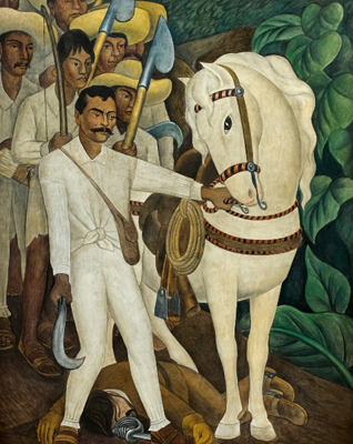
| Agrarian Leader Zapata (1931) |
The Museum of Modern Art revisits its own 1931 single-artist retrospective with Diego Rivera: Murals for the Museum of Modern Art. The original show opened with five frescos that Diego executed on site specifically for the museum. Of these five initial frescos, four, such as Agrarian Leader Zapata, were based on small sections of frescos in Mexico that cemented Rivera’s international reputation as a renowned muralist. The fifth fresco, The Uprising, aesthetically bears resemblance to the group, but is not based on any part of Rivera’s previous murals. After the 1931 show opened, Rivera continued to develop three additional frescos, all original and based on New York City’s architecture and economic issues of class division and industrialization.
All of these frescos were
executed on portable walls in an attempt to solve the problem of showing
frescos to an audience wider than those who could see them on the buildings or
structures upon which they were painted. Americans, most of whom
would not otherwise have seen Diego's frescos, could get a glimpse of what his work
looked like. Unfortunately, a small section of a mural is not the same as the
entire thing. Rivera failed to convey his fresco’s beauty and meaning in these
fractional recreations. Then, as now, his immense talent and ability were not perceived
by those who based their assessments on these works and nothing more.
| Balcony of Cortez Palace in Cuernavaca, Mexico |
The strength of this show is in its didactic approach to
Rivera’s techniques. MOMA takes good advantage of the materials available to
them from recent conservation work on the series, such as x-rays of the wall
supporting the Agrarian Leader Zappata
fresco. The inclusion of information on fresco techniques, such as giornata,
and two of Rivera’s large cartoons help connect the technical details to the
frescos on display. Dickerman even includes a list of the pigments Rivera used
(though neglects to elaborate on binders, which given the other technical
details included feels like an oversight).
 |
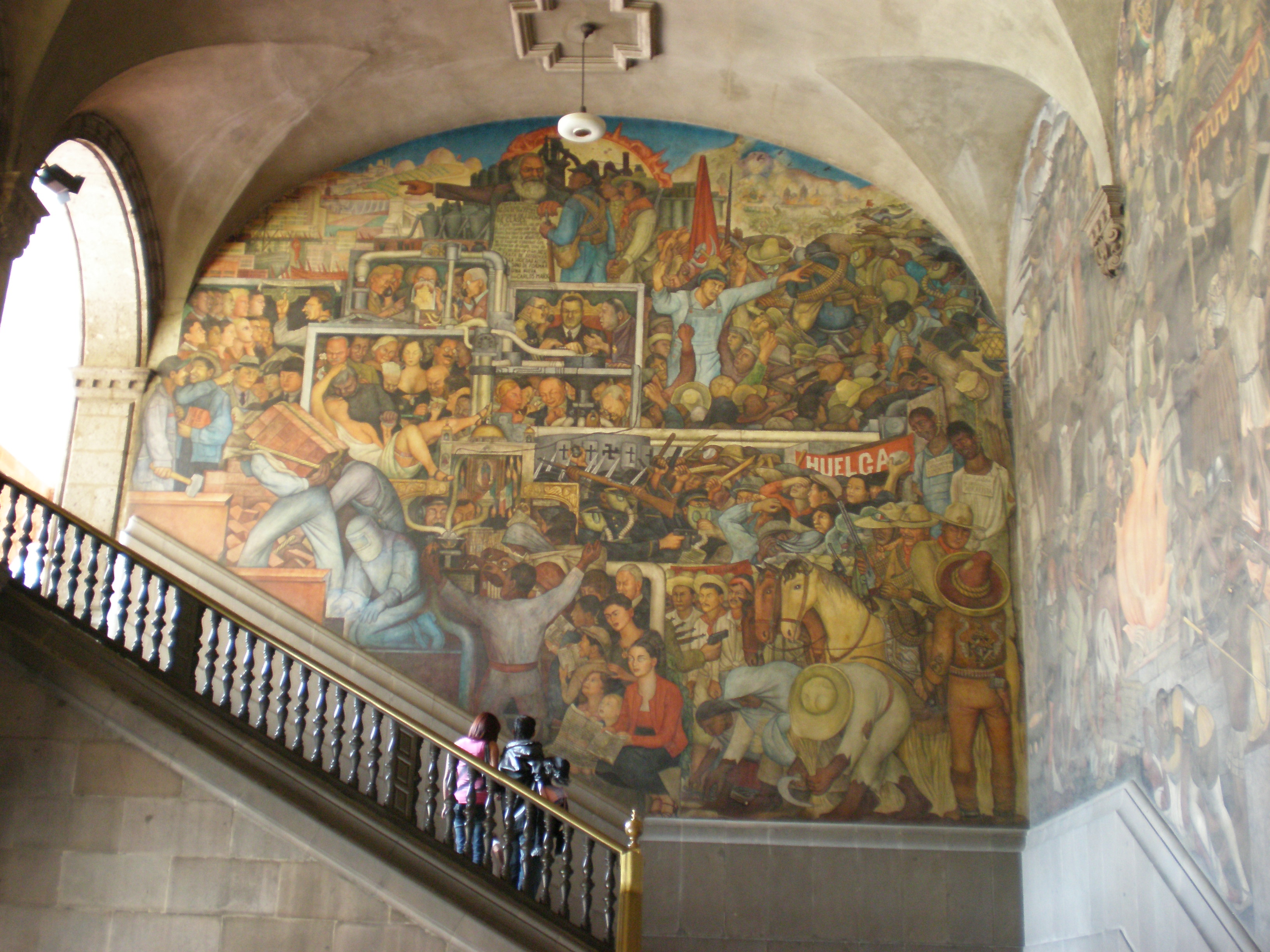
| Rivera's mural at The National Palace in Mexico City |
Unfortunately, the rest of the show is full of even more missed
opportunities and distractions. An example of the latter is the sketches from
Rivera’s trip to Russia. Though Rivera met Alfred Barr while on this trip, there
is no clear reason why the curator chose to include the sketches from Diego’s
trip to Russia, other than to fill space on the wall. The sketches and
information shown about the Rockefeller mural is an example of the former, an
incredible opportunity not taken by the curator. The way this part of the
exhibit is presented, Diego is portrayed as cluelessly spiteful of his American
patron or petty in his oblique political statements. In reality Diego had a
convoluted relationship with America- this played out dramatically around the
Rockefeller mural project. He was rarely anti-America, but he was always
anti-imperialism. Nor were his political interests a surprise to the
Rockefellers or anyone at MOMA. He was simply such a famous, popular and
important artist at the time that he was given commissions at MOMA and
Rockefeller Center in spite of his well-known radical political positions.
Rivera’s unique blend of traditional European iconography with
less familiar Mesoamerican iconography and stylistic references is charged and designed
to signify his work’s broader meaning. The biggest loss from MOMA’s decontextualization
of Rivera and the fresco’s in this show is that it dilutes meaning to such an
extent that viewers are bored instead of challenged.
I really like your assessment of this show and I think you contribute some great thoughts. I was pretty underwhelmed by this exhibition and also felt that it was largely a missed opportunity. The show seemed to focus more on Rivera’s technique and why he used fresco as a medium rather than on his artistic statements. I had no clue that four of the frescos in the show were smaller sections from larger murals he had already done, and I agree that that would have been valuable information. The show felt weirdly intimate for such large-scale works, so it would have been helpful for us to know that that’s not how Rivera originally intended for us to view all of them.
ReplyDeleteI noticed only two typos: in the second paragraph, there should be an apostrophe after “frescos” in “his frescos beauty.” Also, in the very last sentence “an muralist” should be “a muralist.” Another correction applies to the fourth paragraph when you talk about the curator’s oversight by not mentioning binders. I think the plaster is technically the binder in frescos; they add water to the pigment and paint it into the wet plaster without a binder, then the plaster holds the pigment as it dries.
Overall, I really enjoyed your post. Great job!
I like the way this review shows an effective use of historical information. It gives a good overview of the show and helps the viewer to contextualize Rivera's work. This historical issues support the author’s statement and clarify his radical political position. I think this was a good way to invite the viewer to see the show by reflecting on the role of the art space as political filter. Especially it is interesting to reflect on the conflict between his Mexican origins and his relationship with the American institutions. I enjoyed how you organized the review and the way you included attention to details. I am not sure about the importance of the binders, but in general I think the review is full of good observations.
ReplyDeleteI think your review is as incisive as it is illuminating. Having seen this exhibit in person, I was also unaware that I was looking at only sections of larger murals. Putting them in context would have been very helpful. It seems that this show left a lot to the viewer’s imagination and in doing so failed to capture what it set to do. For me, seeing this work in person did nothing to capture that feeling of awe in Rivera’s work that I had come to believe it represented. After reading your review, I now realize that part of my intuitive sense of what the show lacked was due to the way the work was presented. The space, with its low ceiling and smallish floor plan, felt oppressive for the large work of such a well-known artists. As I am writing this, maybe that was part of the curatorial point: to reflect some of the oppression that Diego exposed in his work.
ReplyDeleteAs a painter, I've looked at reproductions of Rivera’s work on and off for as long as I can remember. Other than highlighting his proficiency as a draftsman, the entire show had the feeling it was shoehorned into a less than optimum space in a back room at MoMa that had just had a last minute cancellation. The format did little to inspire viewers to linger and question: I left after a cursory walk through, not because I was disinterested as much as I was feeling cornered in a small, crowded space where I couldn’t breath, let alone see the work.